Client
Arai Brasil
Project
Accelerating Arai Brasil’s online experience
Context & Challenges
For anyone who lives on the track, every detail matters. Arai is not just a helmet brand: it stands for safety, precision and performance worldwide. Online, however, Arai Brasil’s e-commerce was struggling. Disconnected layouts and unintuitive navigation hurt the user experience and held back sales. It was like having the fastest car on the grid, but no reliable driver.
Our challenge was clear: bring everything together on a single platform that reflected the brand’s excellence, giving riders an engaging buying experience while keeping management simple and the system reliable for the internal team.
Diagnosis
Discovery was in place. The funnel broke at the end.
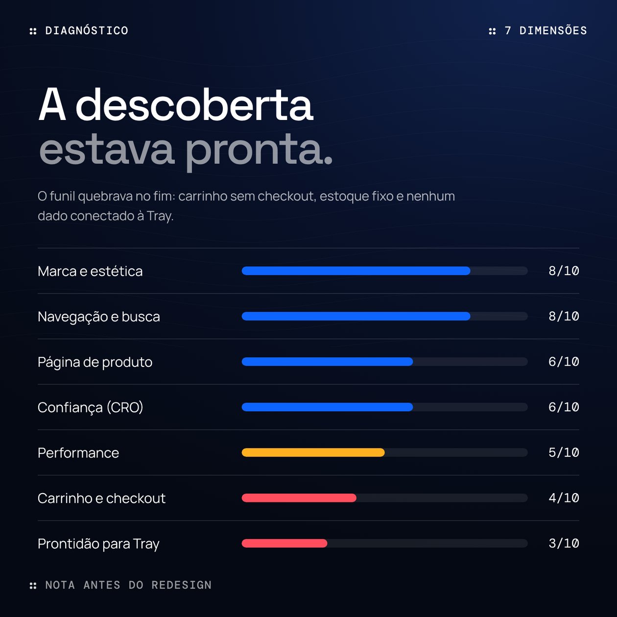
We audited the home page, menu, search, catalogue, product page, bag and footer on desktop (1440 px) and mobile (390 px), scoring each dimension from 0 to 10. Brand and navigation were already at 8. The cart scored 4 and Tray readiness 3: the bag could not edit quantities, did not calculate shipping and led to no checkout.
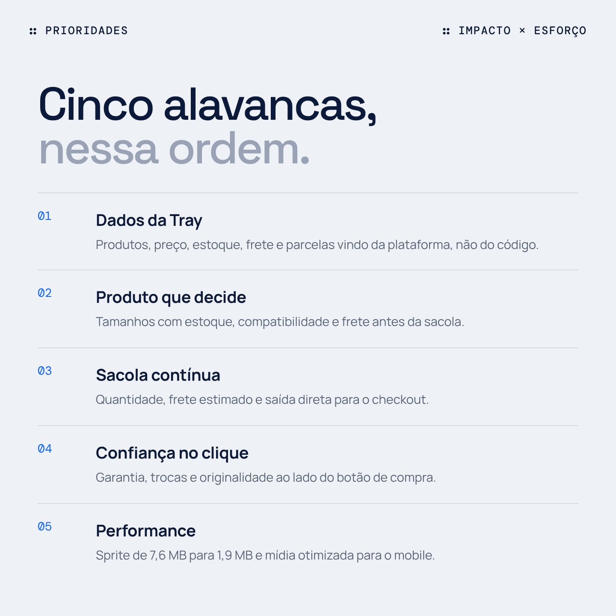
Every finding got an impact (high, medium or low) and an effort (from a day to a week or more). That cross-check produced five levers, in order: connect Tray data, a product page that helps people decide, a bag that flows into checkout, trust at the moment of the click, and mobile performance.
Roadmap
Four waves, three gates, 5 to 7 weeks until the store sells.
The order is the most important decision in the project. The first wave changes nothing the customer sees, but without it the others cannot exist: a size guide and compatibility only work with real stock per variation. That is why conversion tweaks come in the third wave, not the first.
- Wave 1Foundation2 to 3 weeks
- Native Tray theme (Opencode)
- A single token system
- Real catalogue and categories
- Optimised search and media
- Wave 2Purchase2 weeks
- Stock per size
- Bag via the Web API
- Hand-off to Tray checkout
- Account and wishlist with login
- Wave 3Decision1 to 2 weeks
- Size guide
- Buy together with size
- Product summary
- WhatsApp per product
- Wave 4Brandongoing
- App-like mobile
- SEO and AI search engines
- Help centre
- A/B tests
- Gate 1 · real catalogue live
- Gate 2 · first sale through the theme
- Gate 3 · size exchanges going down
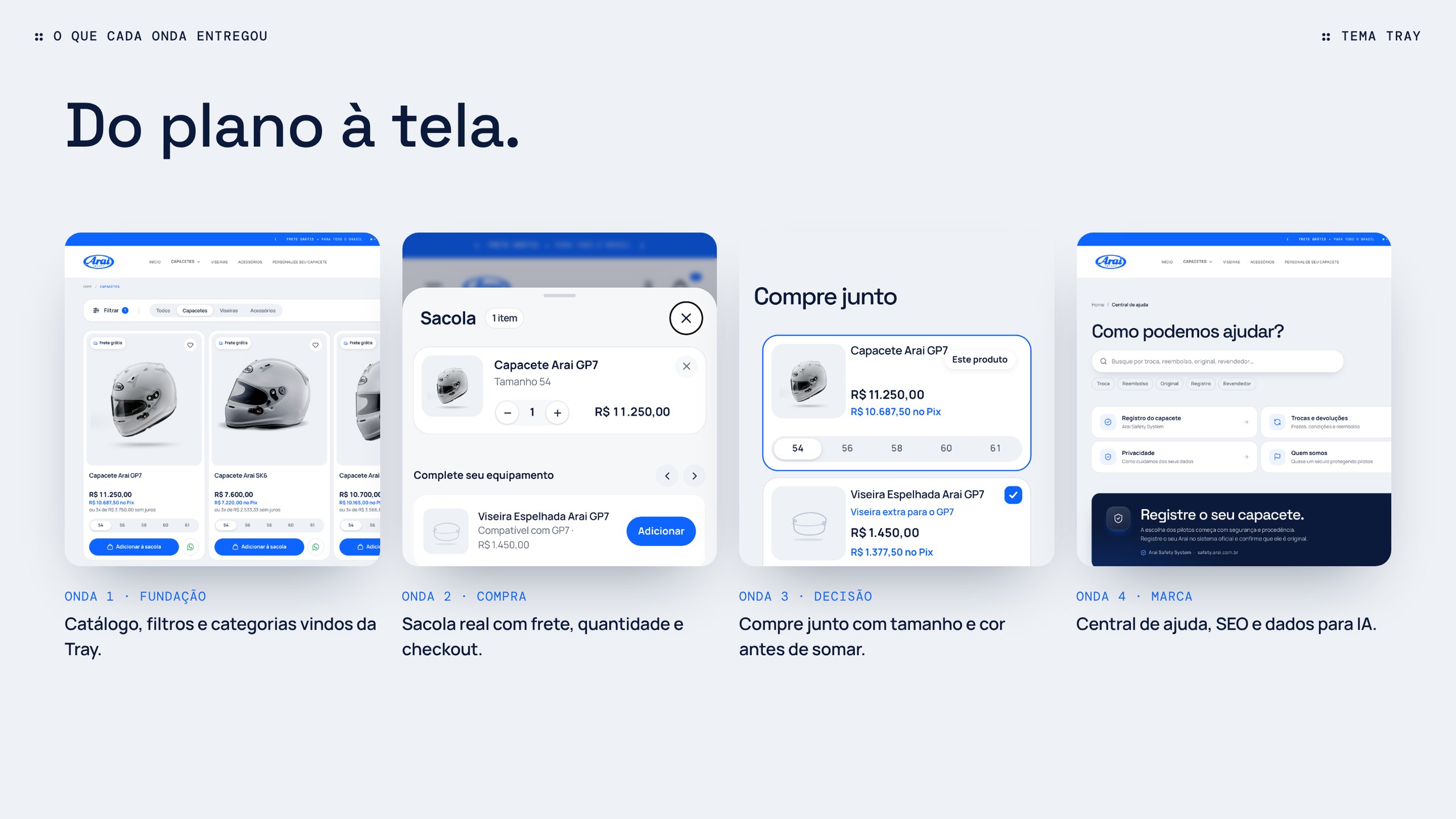
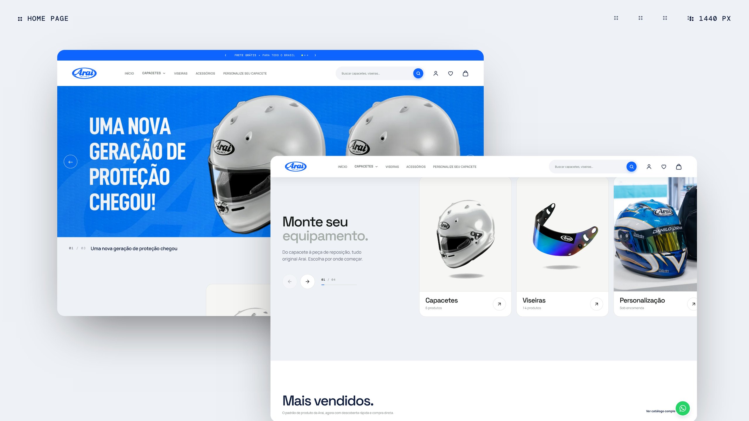
Every wave became a screen. The catalogue now reads categories and variations straight from Tray, the bag talks to the Web API and leads to the native checkout, and “buy together” asks for size or colour before adding the helmet. Price and stock are re-checked on the product page, so a change in the admin shows in the store without waiting for the cache.
Platform
A new track, a new platform.
We decided to really step on it. Instead of simply copying the sites of other countries, we designed a digital architecture from scratch: robust, flexible and made to measure.
We created a modular system that honours Arai’s global identity while giving each product category room for its own personality. The result is a smooth, familiar journey for riders, in line with the brand’s racing DNA.
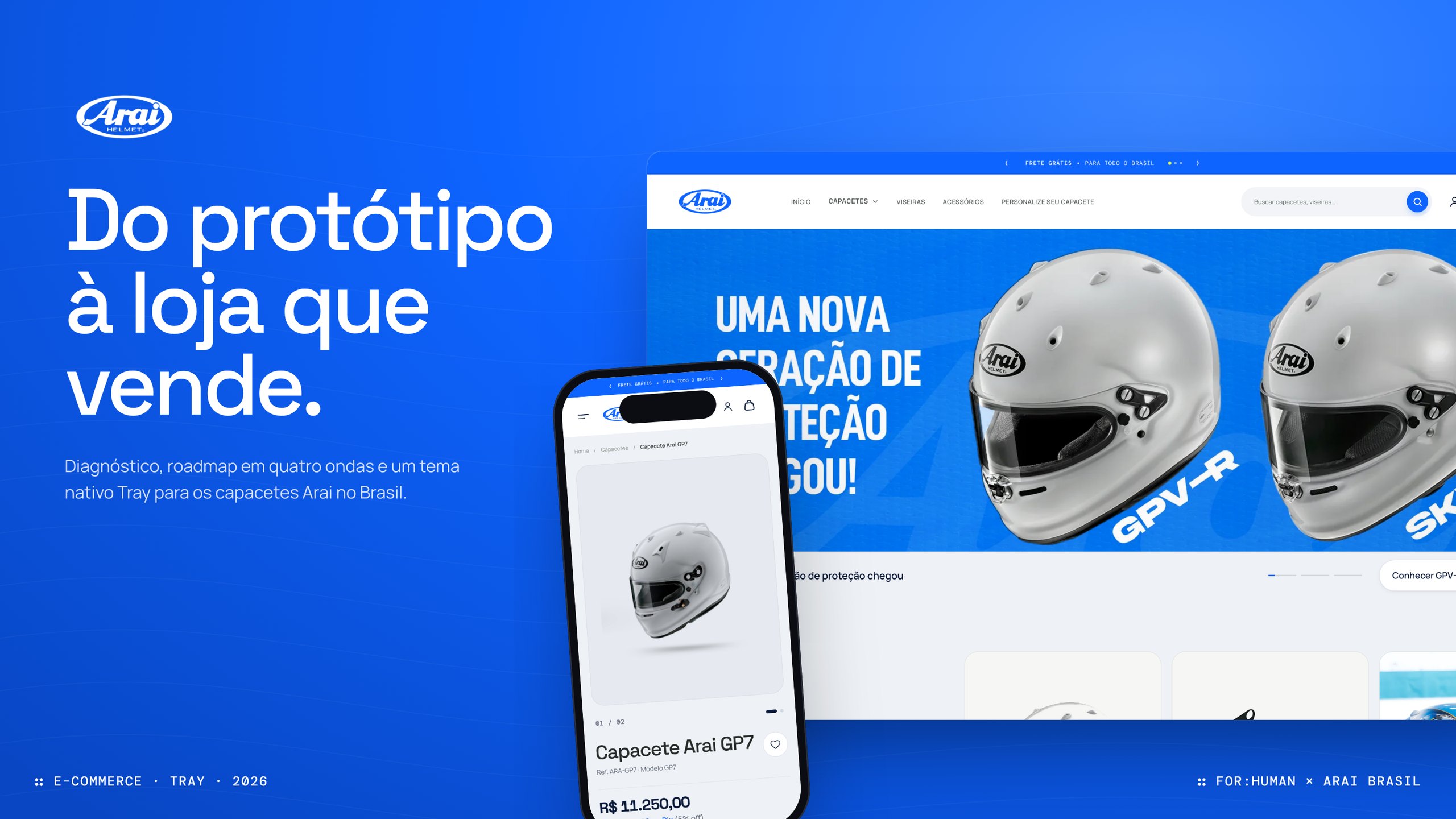
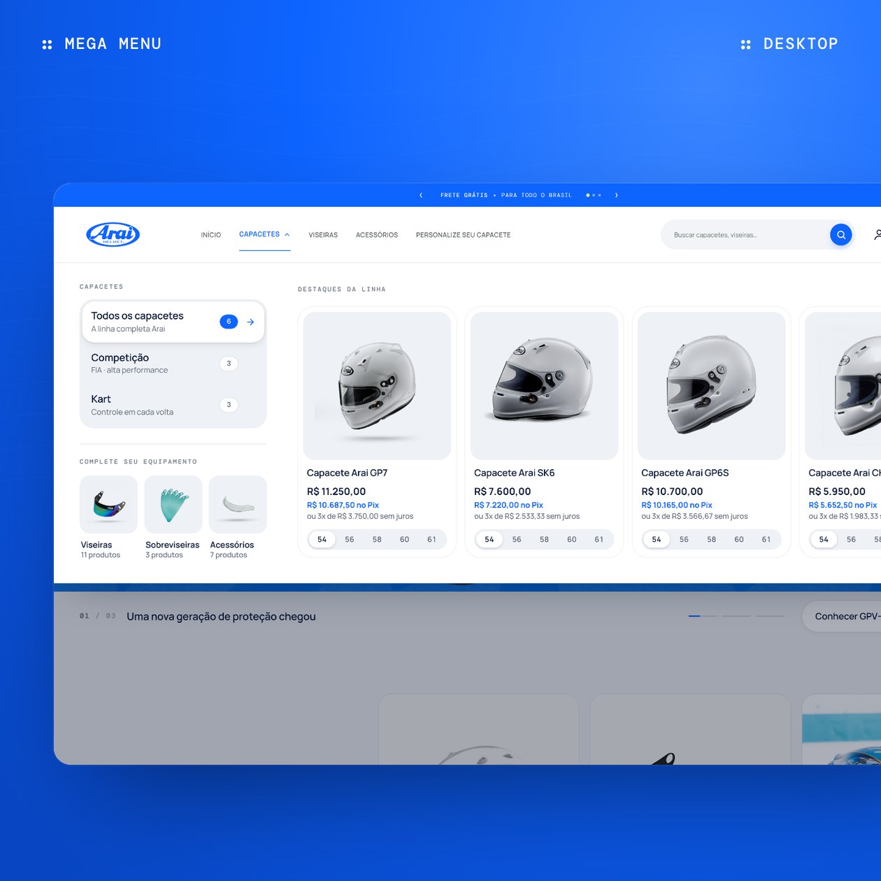
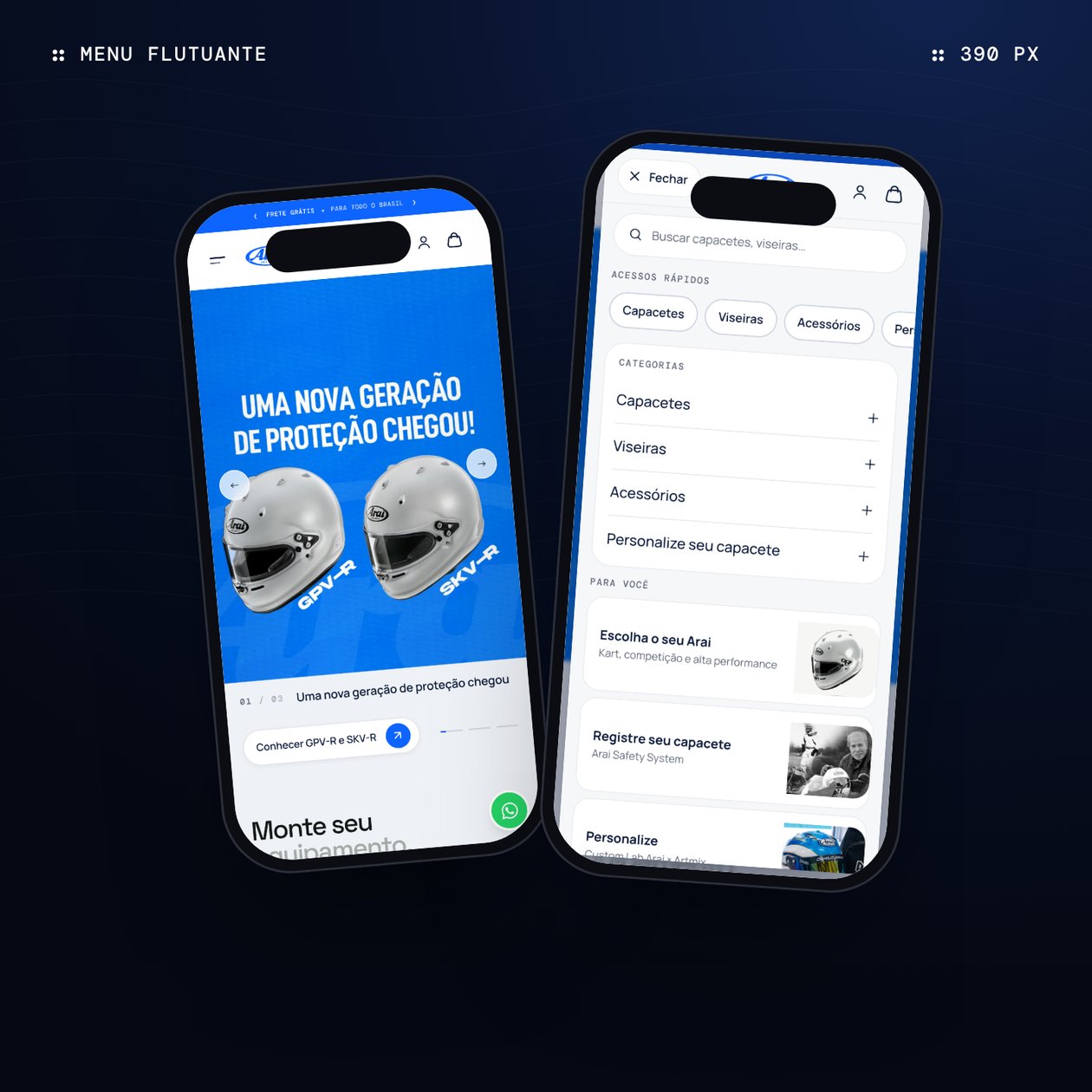
The home page opens with the campaign and immediately asks where to start: helmets, visors or customisation. The mega menu splits helmets by discipline and shows the models with price and sizes. On mobile, the menu becomes a floating card, like the bag, with search, shortcuts and categories.
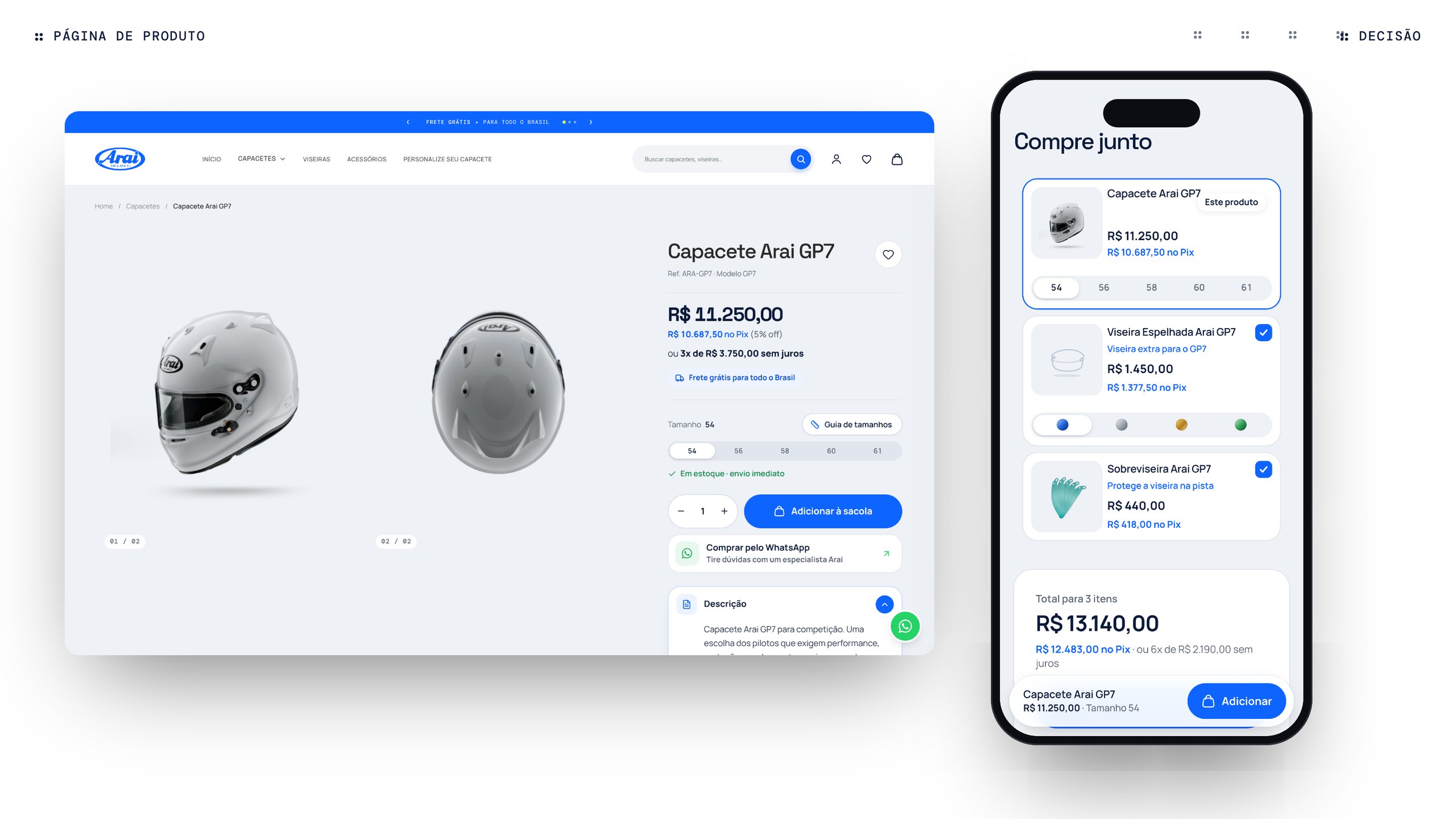
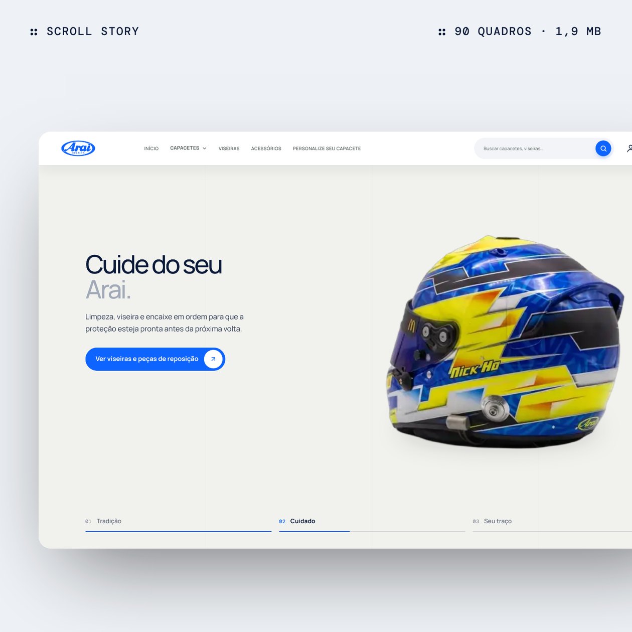
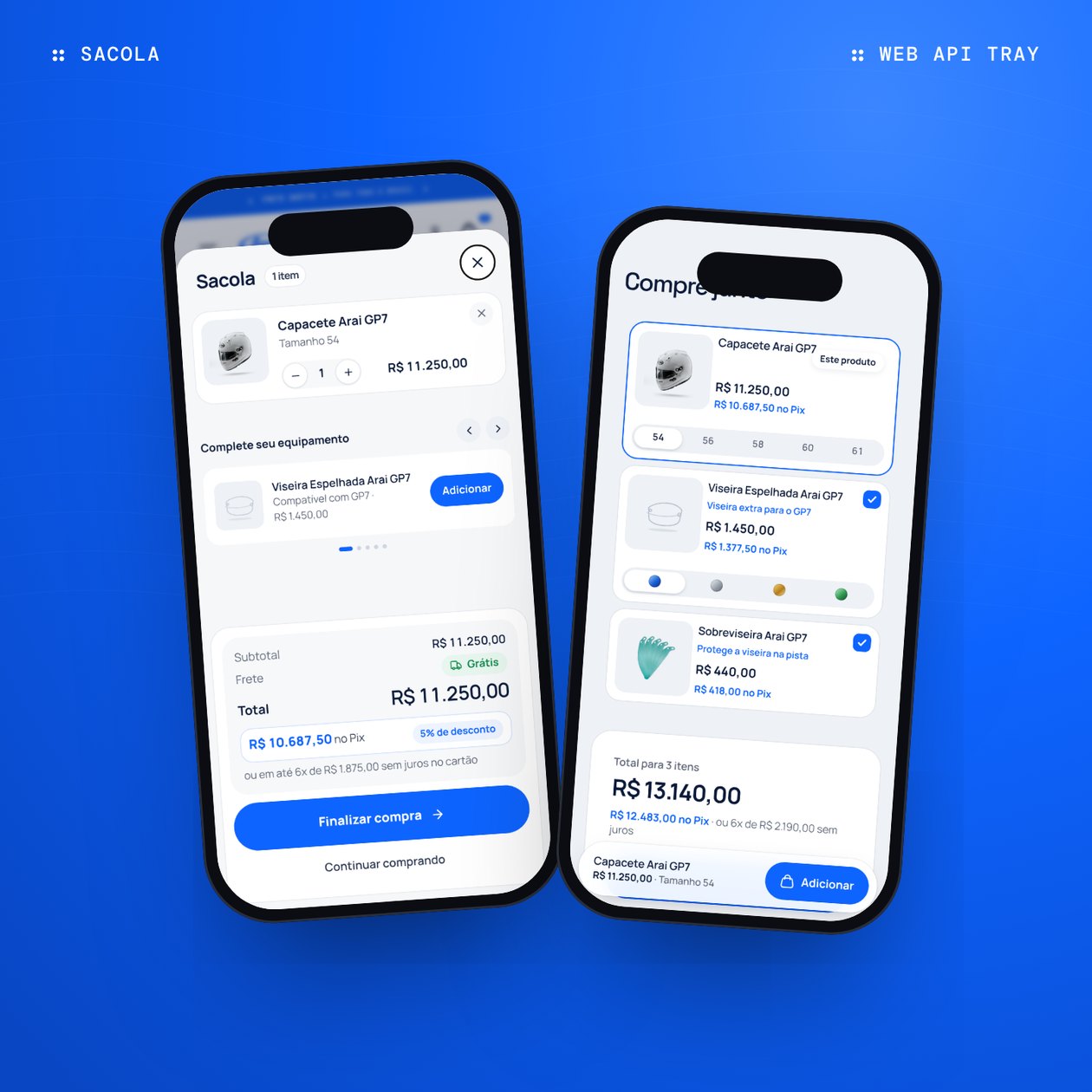
On the product page, size, instant-payment price, instalments and free shipping appear before the button, and sold-out sizes are struck through. “Buy together” suggests a visor and tear-off compatible with the model. The brand story uses a helmet that turns as you scroll: the sequence went from 7.6 MB to 1.9 MB without losing its 90 frames.
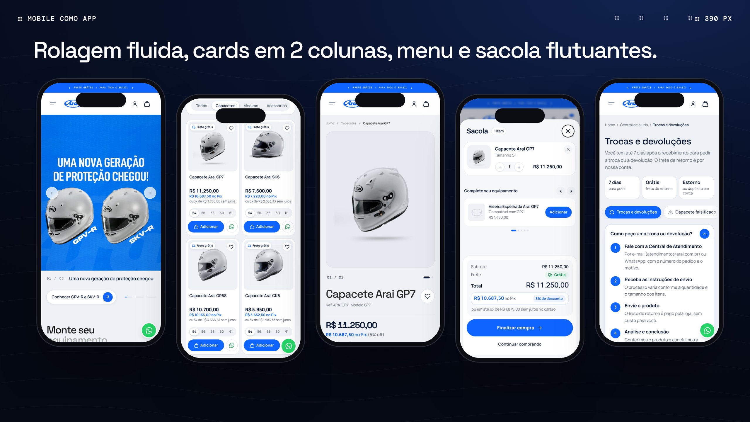
On mobile, the goal was an app-like feel: two-column cards, buy buttons the same size on every product, smooth scrolling and a help centre with answers before WhatsApp. The layout was tuned for phone, tablet, laptop, large monitors and TV, with specific care for Safari.
System and search
A system Tray can repeat on every page.
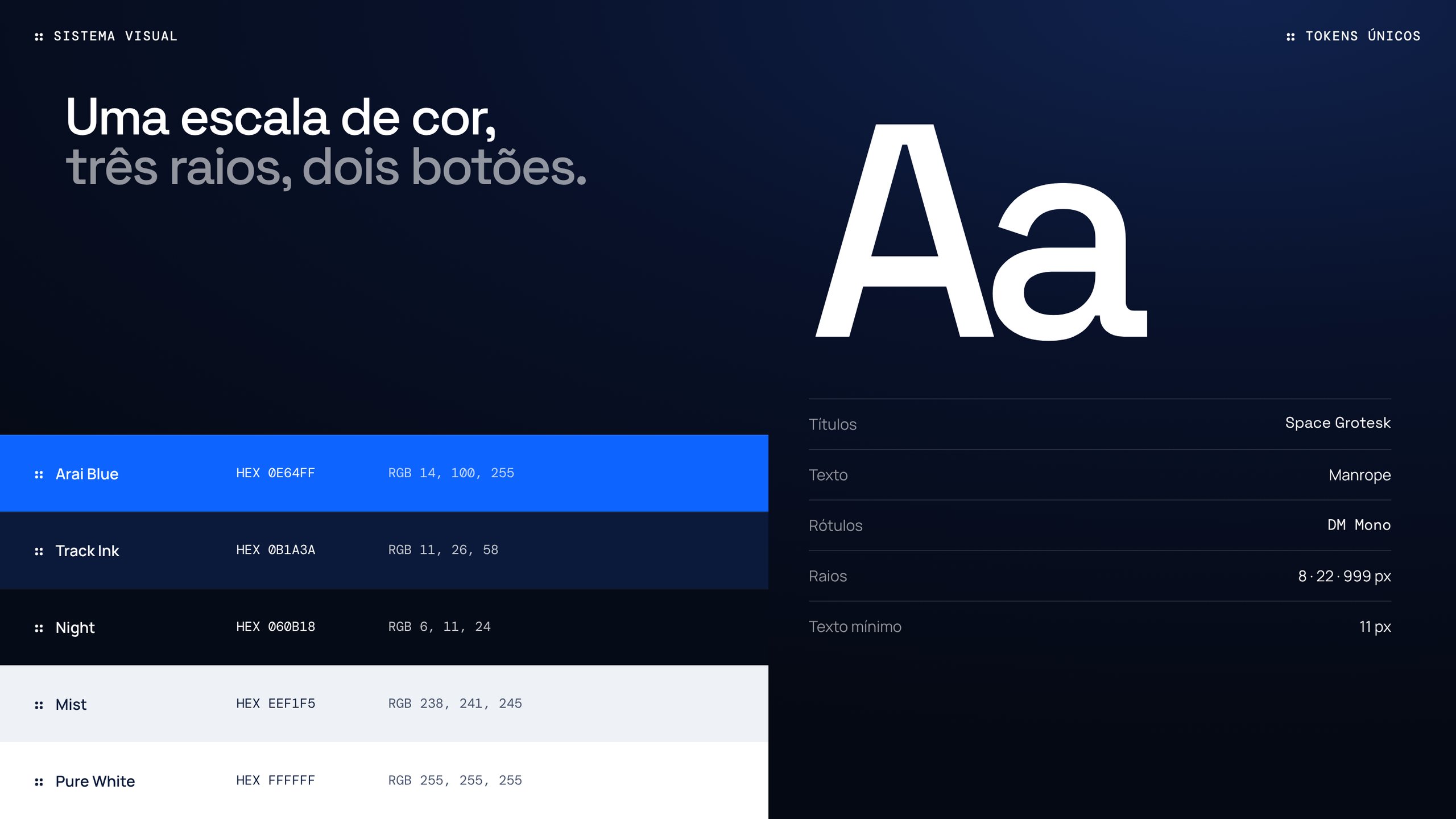
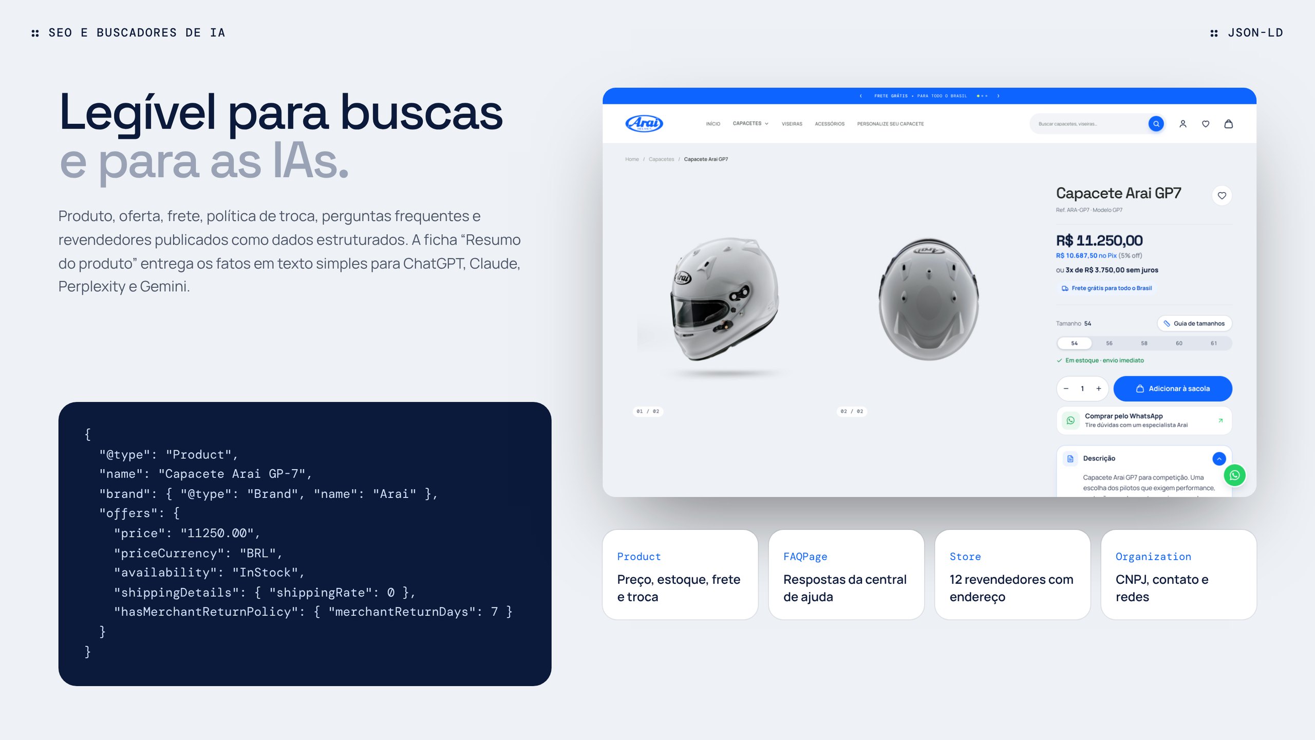
Three palettes that coexisted in the prototype became a single scale built from the logo blue, with three official radii and two buttons. The theme also publishes product, offer, shipping, return policy, FAQs and resellers as structured data, so Google, ChatGPT, Claude, Perplexity and Gemini understand the store without guessing.
Results
Green light for results.
For:Human’s work had an immediate impact. In the very first month after going live on Tray, the new site unified processes, streamlined internal management and raised the customer experience.
Today, Arai Brasil’s e-commerce is more than a store: it is the digital pit stop where riders find performance, confidence and speed in every click.
- Deliverables
- Diagnosis, roadmap, UX/UI, Tray theme
- Platform
- Tray Opencode
- Screens
- Home, catalogue, product, bag, help centre
- Result
- +149% in sales (Jan–Jun 2025 vs. 2024)